
In a city where the Underground map is as iconic as Big Ben, any change to the transport network is bound to raise eyebrows. The recent rebranding of the London Overground’s ‘Orange Line’ is no exception.
As the old familiar orange hue gives way to a spectrum of new colours and apparently quite controversial names, let’s explore the implications of this transformation.
A Farewell to Orange
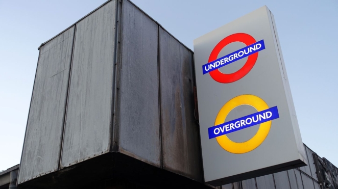
For years, the London Overground has been synonymous with its distinctive orange colour. Whether you were commuting to work or exploring the city as a tourist, that orange line was always your guide and while it might have been the butt of a few joke, it’s a brand that many have held dear.
But change is inevitable, and Transport for London (TfL) has decided to bid farewell to the garish monochromatic simplicity.
Six New Lines
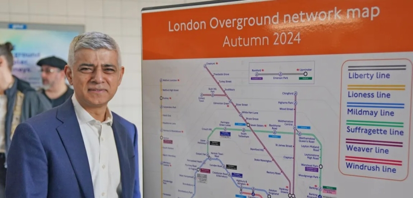
From autumn onwards, the web of orange on the tube map will be replaced by six distinct colours, each representing a different segment of the London Overground.
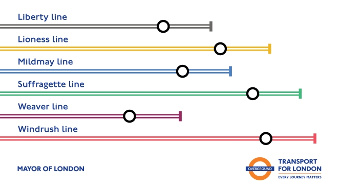
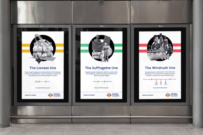
Lioness Line: A bold yellow inspired by courage and strength, this line celebrates historic moments in women’s equality. It’s a nod to the fierce spirit of the suffragettes and trailblazing women who shaped London’s history, as well as, of course, the England lionesses that won the world cup for us back in 2022.
Mildmay Line: Named after the Mildmay area, this deep blue line pays homage to local communities. It’s a reminder that public transport is more than just a means of getting from A to B; it’s a legitimate lifeline for neighbourhoods and communities across London.
Windrush Line: A tribute to the Windrush generation, this red line honours the immigrants who arrived in Britain from the Caribbean. Their contributions to culture, music, and society are woven into London’s fabric and I’m sure while TfL appreciate this won’t wipe the stain of the 2018 scandal completely from public minds, it’s a good start, at least.
Weaver Line: Inspired by craftsmanship and creativity, this purple (or is it brown?) line celebrates artisans, makers, and the vibrant arts scene. It’s a reminder that London is a city of creators and visionaries.
Suffragette Line: A powerful name that echoes the fight for women’s rights. This green line stands for progress, empowerment, and the ongoing struggle for equality.
Liberty Line: Freedom, diversity, and inclusivity define this line. It’s a celebration of London’s cosmopolitan spirit, where people from all walks of life coexist. A little bit generic for my tastes and the grey/silver colour is a little underwhelming, but I appreciate the idea behind it.
The decision to rebrand wasn’t just about aesthetics; it was about clarity. The London Overground, with its 113 stations, had become a complicated web of orange. For tourists and occasional riders, deciphering the network was akin to solving a cryptic puzzle. By assigning unique colours and names to each line, TfL aims to simplify navigation.
Critics and Champions
As with any major change to a beloved public institution, there are always going to be critics. Some argue that TfL missed an opportunity to sell the naming rights, potentially generating revenue.
The Conservative party’s mayoral candidate, Susan Hall, accused Mayor Sadiq Khan of “virtue signalling.” But perhaps there’s value beyond the balance sheet. The new names tell stories—of struggle, resilience, and progress. To me they feel incredibly relevant but then, I’m not a Londoner so my opinion probably doesn’t hold much weight.
Looking Ahead
The London Overground’s rebranding isn’t just about aesthetics; it’s a reflection of the city’s soul. Londoners might often take it for granted but for so many tourists, a London train journey is more than a journey, it’s a connection with history.
It remains to be seen whether this colourful rebrand will have an immediate impact on the overall “brand of London” but by leaning heavily into London’s multicultural and progressive history, it’s one that’s sure to irk right wing cockneys if nothing else. Maybe they should have considered a “Brexit line”?
Another Opinion

Morgan Holt, Chief Strategy Officer @ Saffron Brand Consultants
No one likes a rebrand. If you were a fan before, it feels like a betrayal, and if you weren't, then it hasn't fixed the problem.
The brand design is a signal to an experience. So, a rebrand needs to be backed up with a relevant, different, and authentic brand experience.
One that you cannot get anywhere else, and that people love to use and talk about. If the experience doesn't change, the brand won't change no matter what logo you put in front of it.
With the intention to ease experience by making each branch of the Overground identifiable with an individual colour and name, there’s reason to believe the experience will improve.
But as we’ve seen with Twitter/X, when something is so deeply ingrained, it can be hard to persuade the public to adopt and adapt. Only time will tell how well this change goes down.
At the end of the day the tube is to London what an airport is to a country: a beacon of the 'London' brand experience. If it's great, London will benefit. If not, everyone suffers